A guided look at where collisions cluster, how they change over time, and what patterns stand out.
Collisions by Year - H3 Map
Collisions are grouped into H3 hexagons so collisions can be easily aggregated into areas.
Use the year slider in the left panel to move through time or switch to All Years to see persistent hotspots.
Central London stays bright across years, while some outer clusters appear or fade with road works, new venues, and routing changes.
Collisions by Year - Boroughs
This view compares total collisions by borough across years. Westminster tends to rank high due to footfall, nightlife, and through-traffic.
Use the year chips to jump across time and the sort control to switch between current level and year-on-year change. You can also use Sort feature to sort Boroughs.
Sort
Total collisions——
Current
Previous
▲ Up / ▼ Down
Years
Westminster aligns with busy destinations, mixed travel modes, and turning movements.
There is a sharp increase due to COVID-19 in year 2020 and a sharp increase after the end of quarantine in 2021.
Overall there is a downward trend from 2015 to 2024 in number of collisions each year.
Charts and Highlights
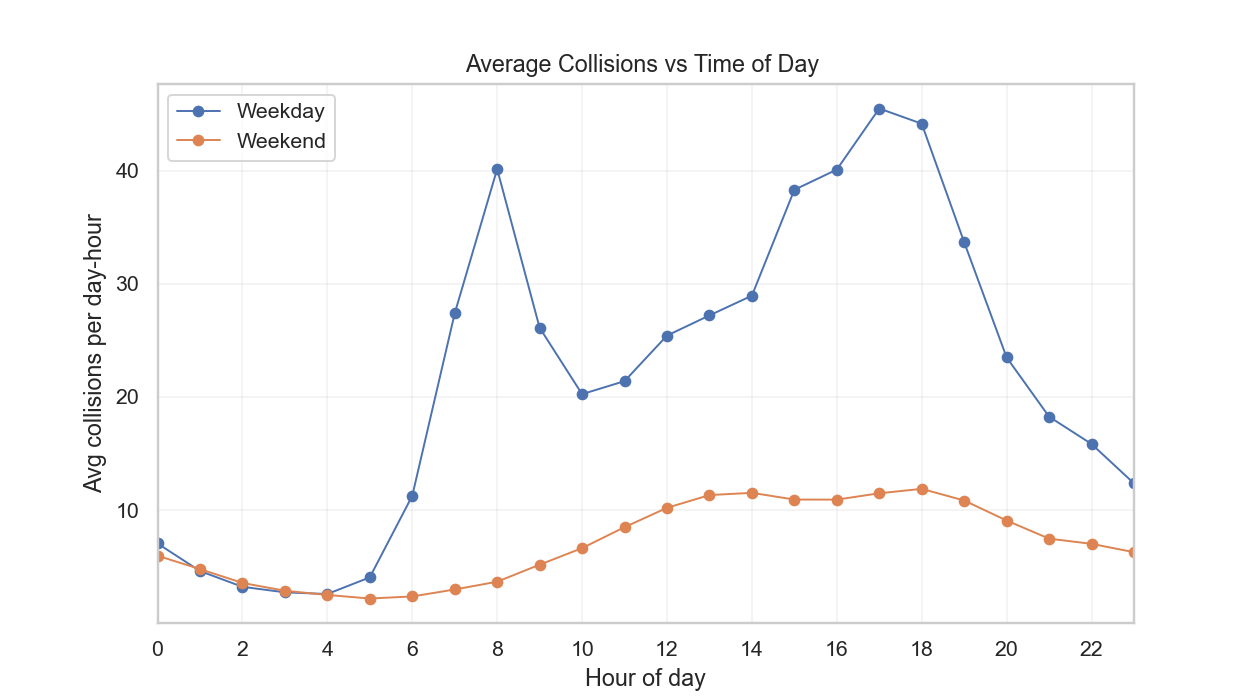
By hour, weekdays vs weekends. Values are normalised by the number of days so the lines are directly comparable.
Weekdays show two peaks, around 7 to 9 in the morning and 6 to 8 in the evening, which matches commuting patterns.
Weekends rise from lunchtime into the night.
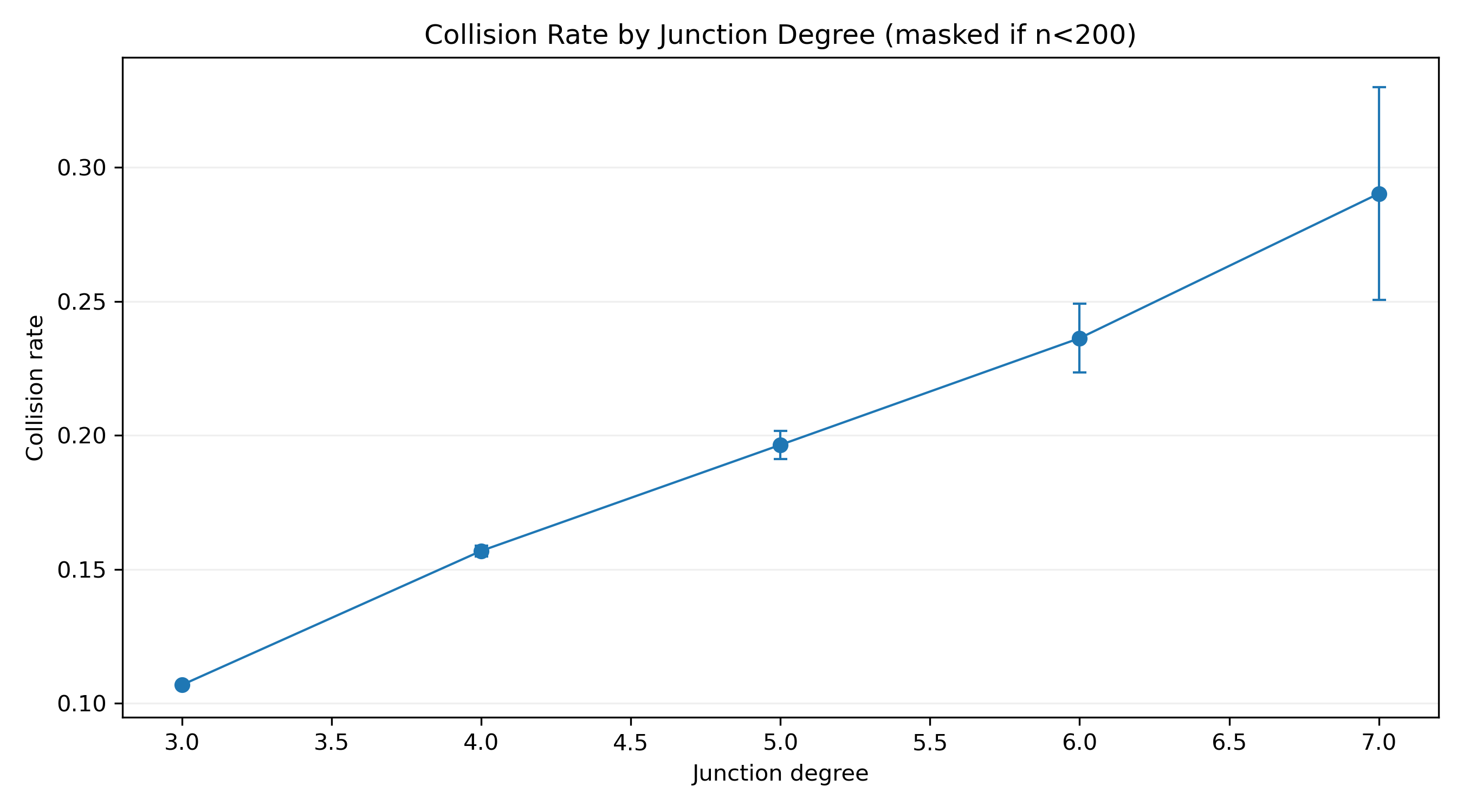
Junction complexity. As the number of arms increases, the collision rate rises.
A three-arm T junction has fewer conflict points than a four-arm crossroads.
Higher-degree junctions add more turning movements and more chances for gap misjudgment.
If one upgrade is possible, start with the highest-degree sites.
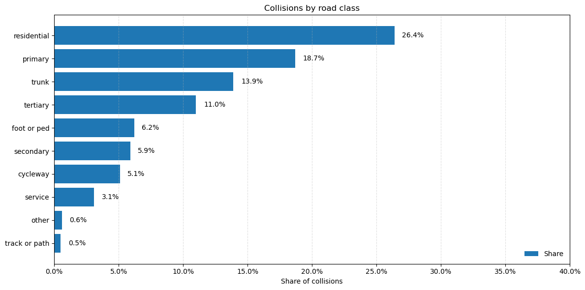
Total collisions by road type. Residential streets dominate counts because they cover a large share of the network and carry many short trips.
Counts are not rates. If normalised by length or traffic flow, the ranking can change.
This is why the model also uses road class shares rather than relying on raw totals alone.
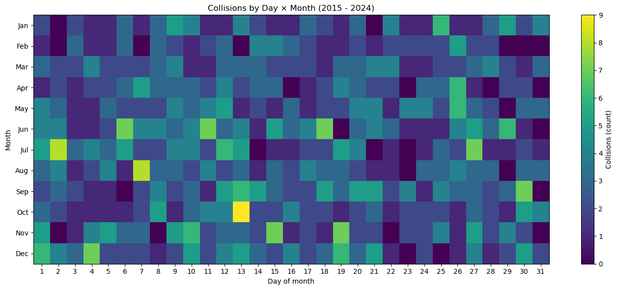
Season and notable dates. There is a increase in collisions during early half of the months compared to later halfs, may indicate people go outside more at the start of the months.
The highest single day appears on 13 October. Other spikes align with well known dates and events.
6 June — D-Day anniversary 13 October — UN International Day for Disaster Risk Reduction, 19 November — International Men’s Day 18 June — Waterloo Day
These are signals to double-check weather, daylight, and local activity, not automatic causes.